A Picture Worth a Thousand Words
A picture worth a thousand words
This picture is used so much that trying to post about it seems like deja vu
Additional comments:
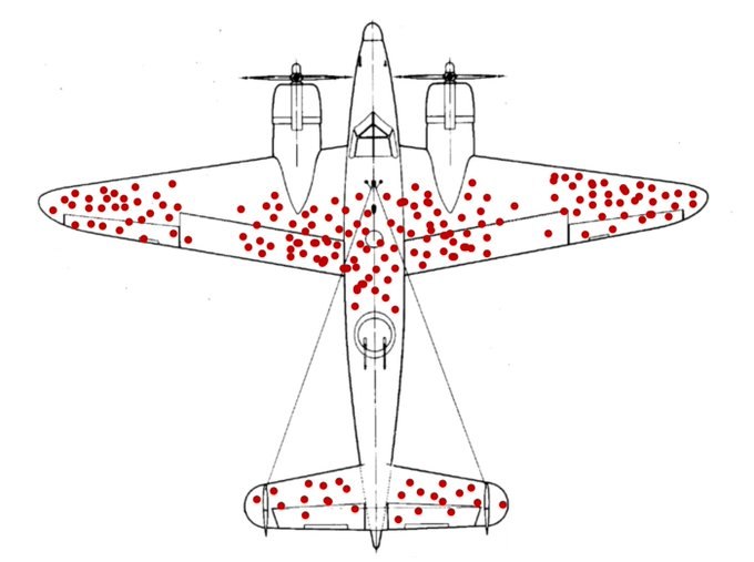
This famous diagram serves as a perfect illustration of survivorship bias. During the Second World War, military researchers analyzed aircraft returning from combat missions to determine where they needed additional armor. They initially focused on the areas covered in bullet holes, believing that shielding these spots would save the planes. Abraham Wald reached a different conclusion. He realized that the red dots represent damage that planes could sustain while still managing to return to base. The empty spots on the wings and the engine areas were actually the most critical locations to reinforce. Planes hit in those sections were lost entirely and never made it home to be counted. Data often tells a misleading story if you fail to account for missing information. This image remains an essential lesson in critical thinking and logical analysis.